
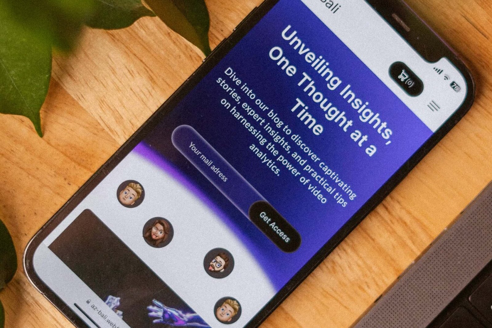
Mobile-first web design 60 traffic depends is a core growth area where WebSenix helps businesses build faster websites, improve conversions, and scale with confidence.
60 % Is Only the Beginning
- Global mobile traffic: 60.9 % (Statcounter, Sept 2025)
- Local search: 66 % on phone  78 % of those visit within 24 h (Google)
- Black Friday 2024: 76 % of e-commerce checkouts started on mobile
Conclusion: Mobile-first Ôëá nice-to-have. ItÔÇÖs survival.
What ÔÇ£Mobile-FirstÔÇØ Actually Means in 2025
- Design for 360 px width first, then scale up (not shrink down).
- Core Web Vitals must pass on 4G throttled CPU.
- Tap targets 48 px, thumb-zone CTAs, swipe gestures enabled.
- Checkout <30 seconds with Apple-Pay / Google-Pay / Shop-Pay.
- Content parity: every feature on desktop exists on mobile (Google penalty if not).
The Money Side: 1 Second = 7 % Revenue
- 1 s delay  7 % drop in conversions  $7 k lost on every $100 k sales.
- Walmart 2025: Mobile load 0.9 s  2 % lift in revenue per visitor = $200 M extra.
- Websenix client avg: Mobile-first rebuild  +32 % revenue within 90 days.
SEO: Mobile-Only Indexing Is Live
Google crawler 2025:
- No desktop user-agentÔÇöif itÔÇÖs hidden on mobile, it doesnÔÇÖt exist.
- Page Experience update: CLS <0.1, LCP <2.5 s, INP <200 ms on mobile or rank drops.
- Intrusive interstitial penalty: pop-ups >30 % screen = -10 positions.
Mobile-First Must-Haves (Checklist)
- Viewport meta + responsive CSS grid (no fixed widths).
- Images in next-gen formats (WebP, AVIF) +
srcsetfor 1×, 2×, 3× DPI. - Critical CSS inlined, JS deferred, server-side rendering for React/Vue.
- Sticky header Ôëñ60 px + bottom CTA bar (thumb reachable).
- Autofill, scan-card, one-tap login (FIDO2 / Passkeys).
- Font-display: swap + system-font stack = 0 layout shift.
- Lighthouse score ÔëÑ90 on Moto G4 throttled (GoogleÔÇÖs testÕƒ║Õçå).
Quick Self-Test (30 Seconds)
- Open site on phone  3-bar signal.
- Time first paint with stopwatch. >2.5 s? Fail.
- Thumb-reach the main CTA with one hand. No? Fail.
- Scroll to bottom ÔÇô any horizontal scroll? Yes? Fail.
- Click checkout ÔÇô can you pay without typing address? No? Fail.
3+ fails = call a pro.
Real Rebuild: Before vs After Mobile-First
| Metric | Old Desktop-First | Websenix Mobile-First |
|---|---|---|
| Mobile Load | 5.2 s | 1.4 s |
| Lighthouse | 52 | 98 |
| Mobile Bounce | 68 % | 29 % |
| Conversions | 0.9 % | 5.1 % |
| Monthly Revenue | $18 k | $97 k |
Payback period: 54 days.
Build Once, Sell Everywhere
Mobile-first also feeds:
- Smart watches (micro-apps)
- In-car browsers (Android Auto / Apple CarPlay)
- Voice search (Google Assistant, Alexa)
- Progressive Web App  app-store-less install icon.
Need a 90+ Mobile Score?
Websenix delivers sub-2 s mobile loads, thumb-first UX, and guaranteed Lighthouse 90+ or we work free until it hits.
Free mobile audit & quote in 24 hrs
Mobile-first Web Design 60 Traffic Depends Strategy
Our team applies proven planning, UX, development quality, and technical SEO practices so each project delivers measurable business results.
Need help implementing this for your business? Explore our services or contact WebSenix for a tailored roadmap.